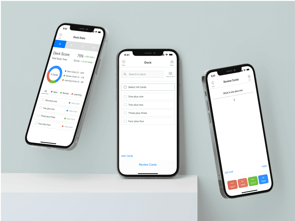
AnkiMobile App Redesign
Sep 2022 - Oct 2022
Improving the usability of a mobile flashcard learning app.
Problem
Situation
I've used AnkiMobile for years, but have always found that navigating the app was confusing.
Task
I thought of redesigning the AnkiMobile application so that it is more user friendly.
Outcome
Action
I conducted research and usability testing based on the existing AnkiMobile application to identify existing pain points.
Created prototypes based on findings and conducted usability tests to validate design changes.
Result
Usability tests conducted with my redesign compared to the existing AnkiMobile app showed an improvement of 14% in usability according to metrics by Maze.co.
Designs
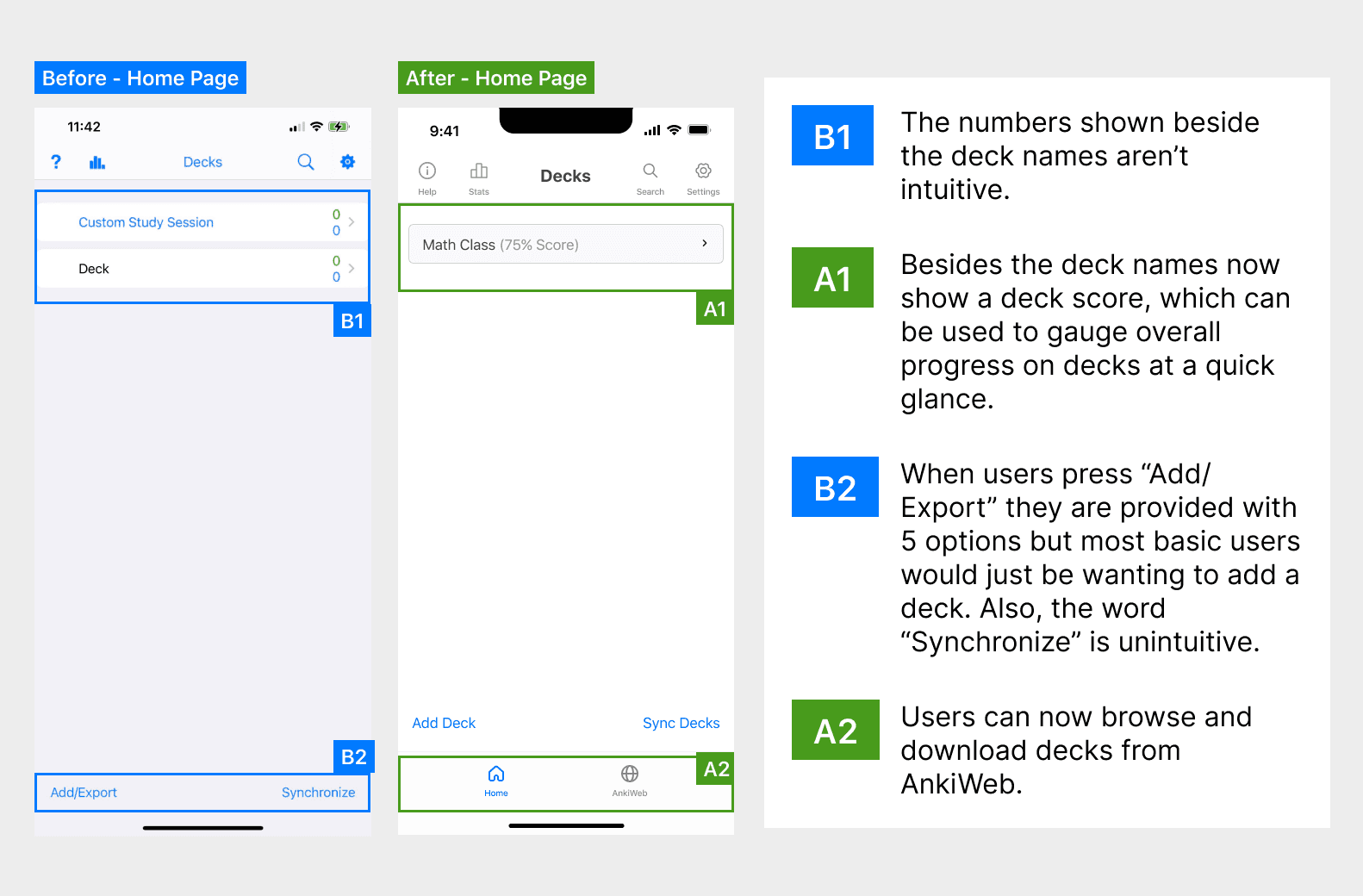
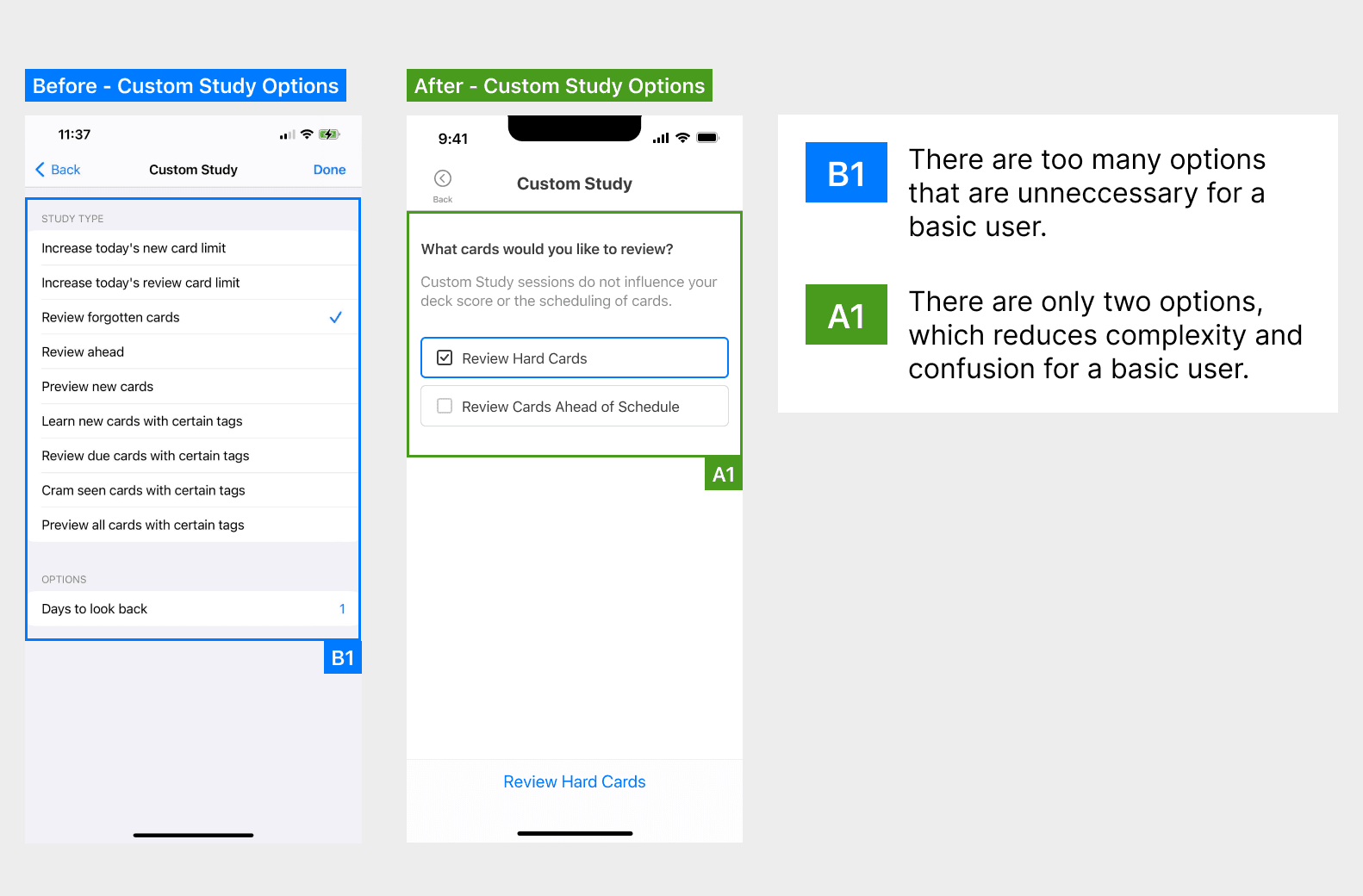
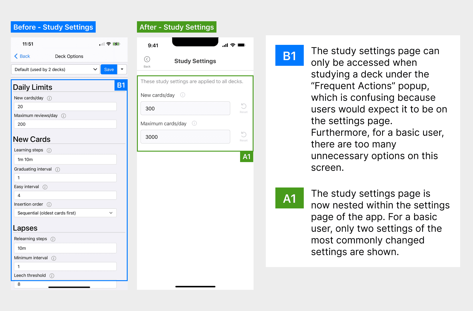
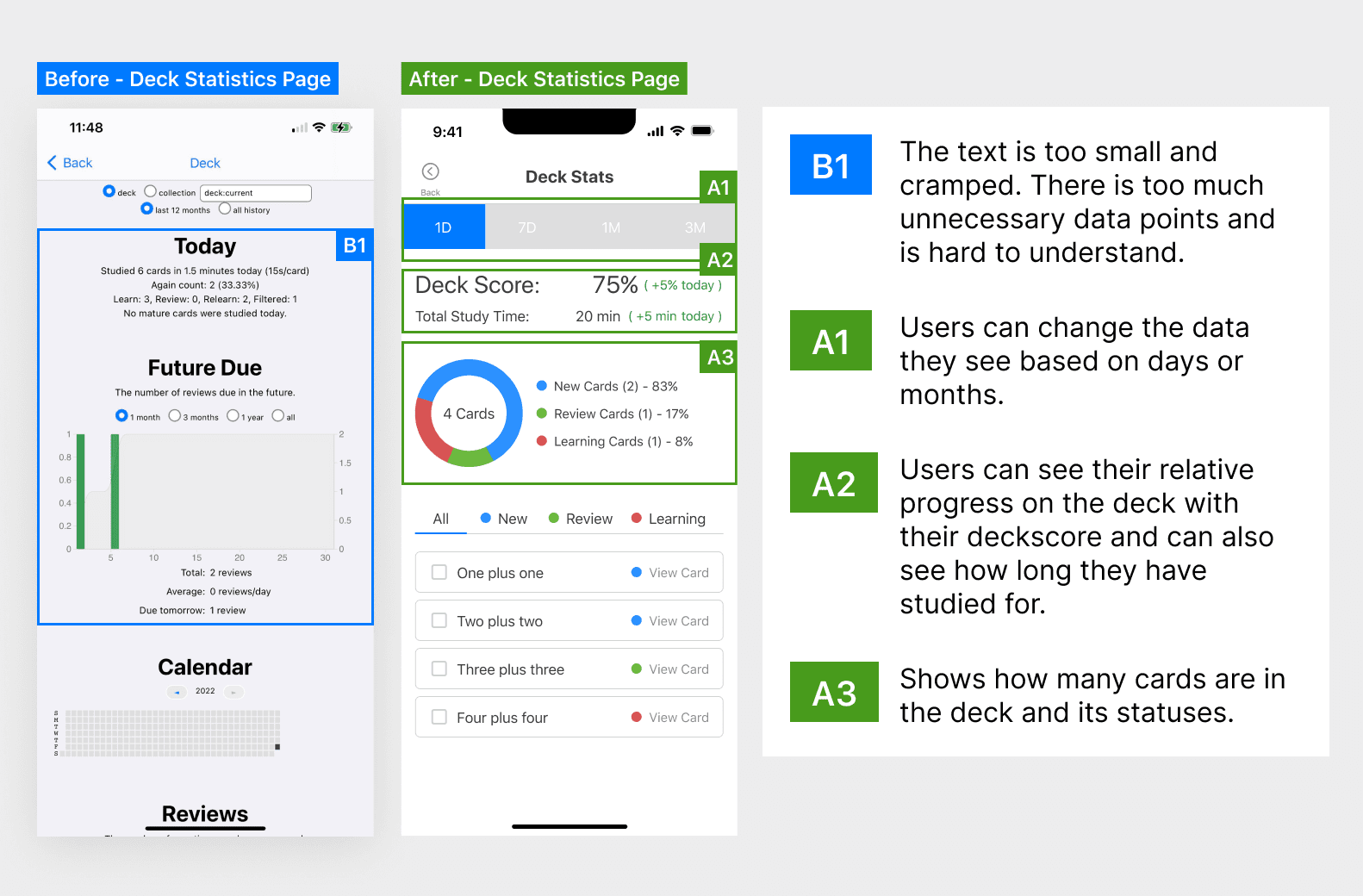
Before and After
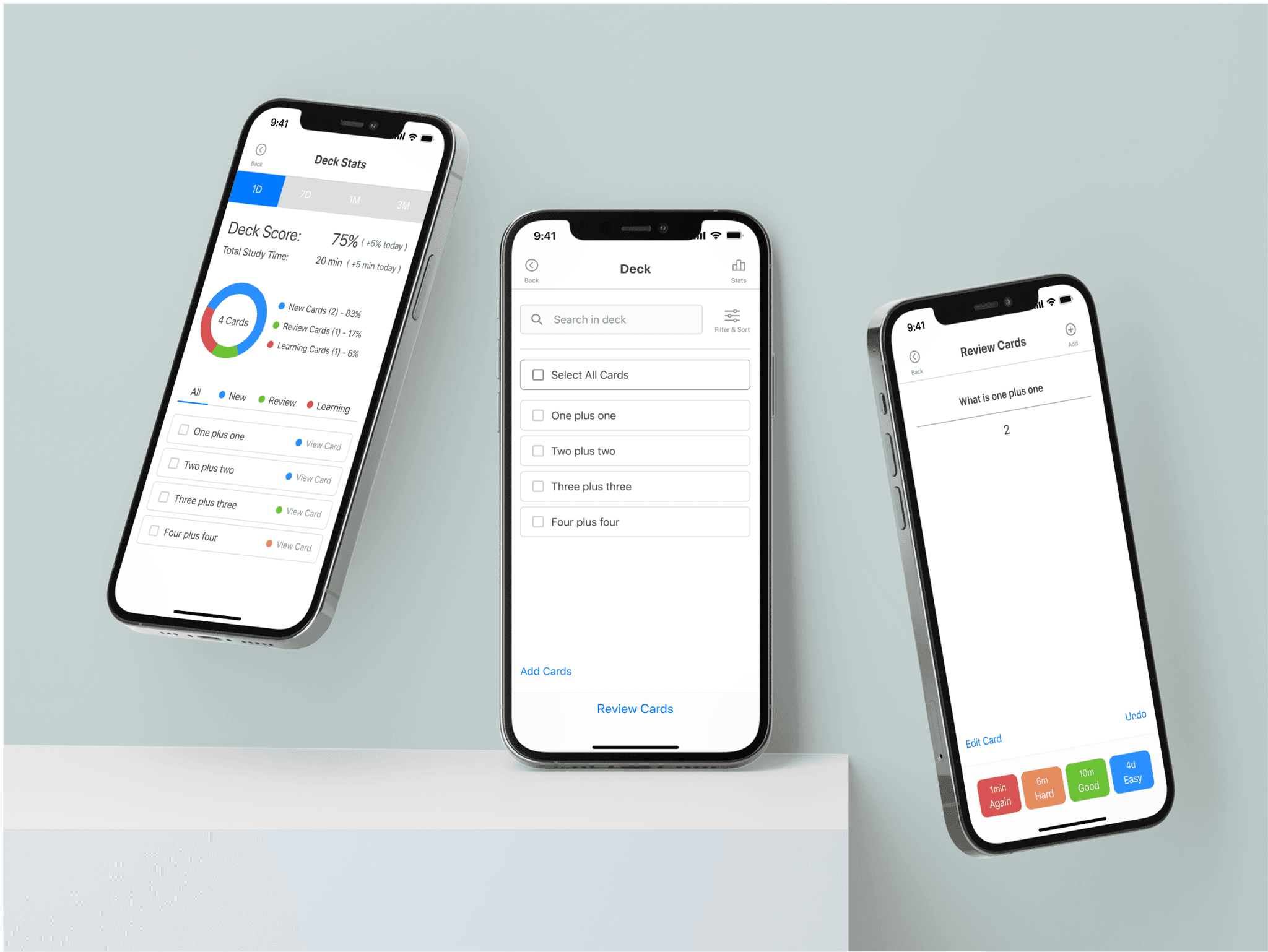
Below are comparing the original AnkiMobile application to my redesigned version.
The Design Process.
Discover
Seeing What Ankimobile Users Have to Say
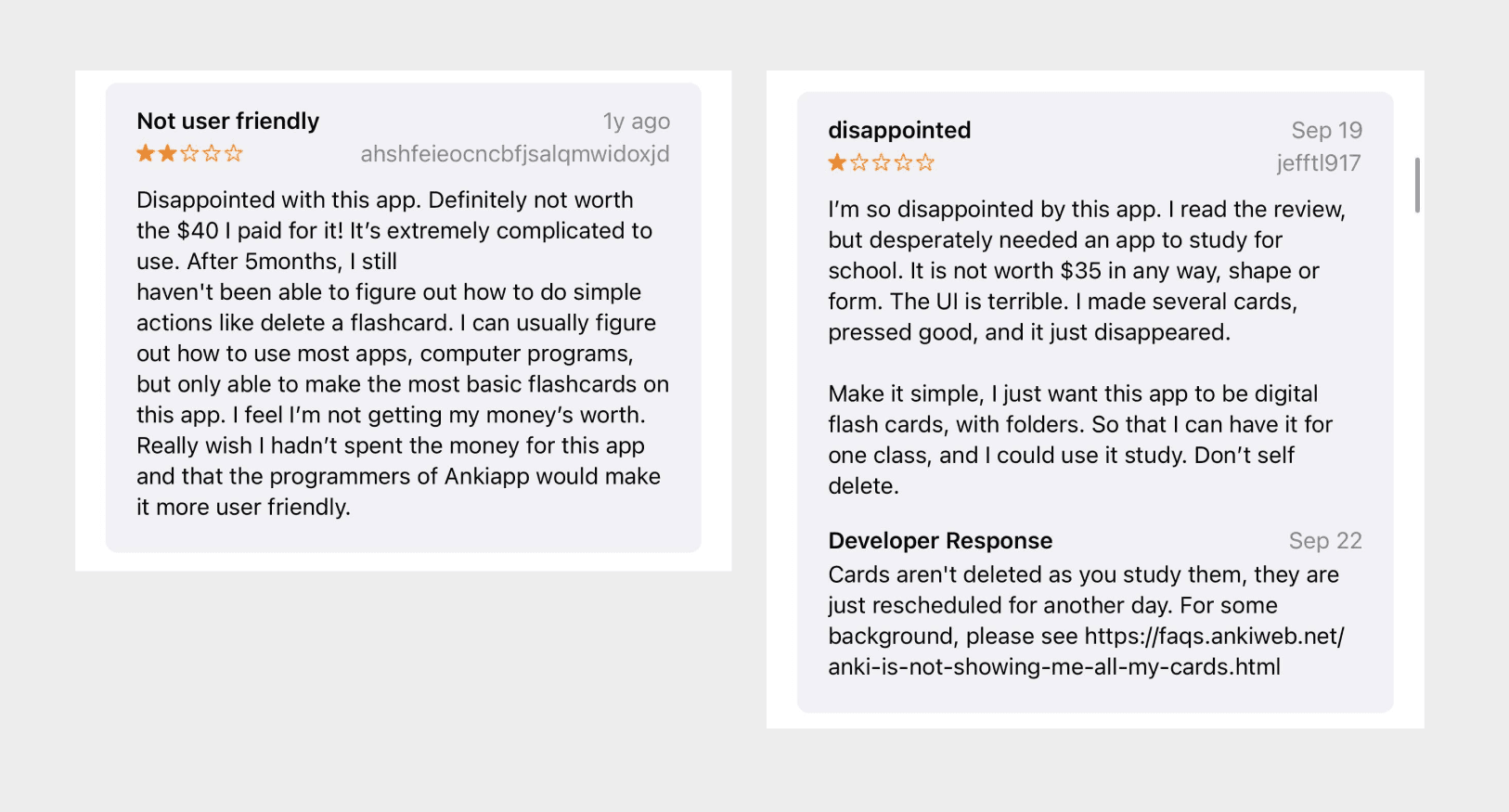
To validate that AnkiMobile would benefit from a redesign, I analyzed AnkiMobile’s reviews on the iOS app store and found many users commenting that the app was not user-friendly.
Conducting Usability Tests with AnkiMobile
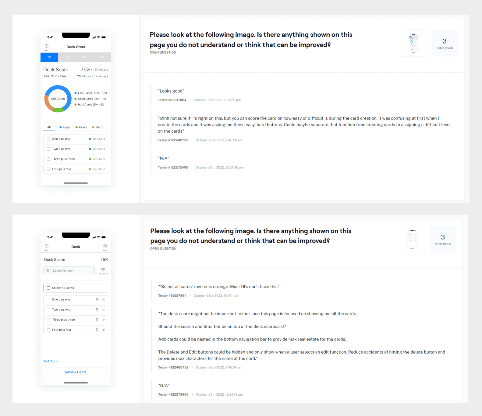
Realizing that online reviews might often be biased, I created a prototype using screenshots of AnkiMobile’s existing task flows so I could conduct a usability test to gather insights into what people thought about AnkiMobile. An unmoderated usability test with 3 people using Maze.co.
AnkiMobile Usability Test Results
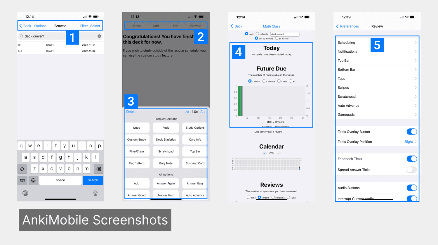
To get qualitative and quantitative data on what people thought about AnkiMobile, I created a prototype using screenshots of AnkiMobile’s existing task flows and conducted an unmoderated usability test with 3 people using Maze.co. Below are the consolidated findings from the usability test.
Ambiguous buttons - a user might not understand what pressing these buttons do as they all share the same text hierarchy.
Non-intuitive buttons - a user may not know what some of these buttons do, i.e “Options” and “Select”
Too many buttons - a user will be overwhelmed by the number of buttons, some of these are unnecessary for the average user
Confusing graphs - a user may find these graphs hard to understand
Too many options - a user will be overwhelmed by the number of options, some of these are unnecessary for the average user, making it difficult to navigate
Competitive Analysis
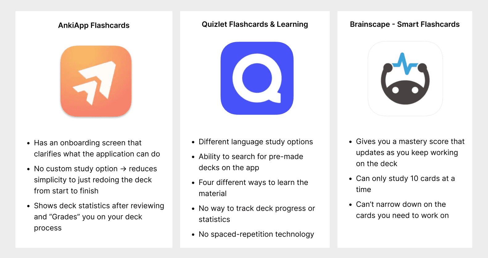
Before jumping into the design, I took a look at 3 highly rated flashcard applications from the appstore to see what Anki is currently doing well, and what can be improved in comparison. From doing this, I noticed that Anki’s competitors overall offered more features and were more intuitive right off the bat. I noticed that the area where Anki thrived is in utilizing spaced repetition techniques.
Define
Design Principles and Ideas
With so many ideas and insights founded from the discovery phase, I decided to summarize them into core design principles and ideas that will help guide me with the application design.
Allow users to choose if they are basic or advanced users. For basic users, only keep the functionality that most users will use
Introduce an optional onboarding tutorial for users
Allow users to browse and download shared Ankidecks and to also share their own decks
Stick to an experience that AnkiMobile users will be familiar with, not reinvent the wheel
Maintain a consistent experience throughout the app
Scope
Due to the limitation of the BCIT course schedule, it was not feasible to redesign all aspects of the AnkiMobile app. Therefore, I decided to focus on redesigning the core tasks flows for a basic user which include creating a deck and reviewing cards.
Develop
Usability Testing Designs
Due to the tight timelines and because the UI for AnkiMobile is quite simple, I created some simple prototypes of the redesigned AnkiMobile app to gather feedback as soon as possible.
First Iteration - 88% Usability Score, tested with 3 users
In summary, the feedback for this iteration included:
Providing more clarity on buttons through an improved copy
Removing information that doesn’t belong on certain screens
First Iteration - 88% Usability Score, tested with 3 users
I took the feedback received in my first iteration and conducted another round of usability tests with the updated iteration to receive quantitative and qualitative written feedback for each task.
Identified Solutions
After analyzing the feedback I received, I identified the following areas of improvement, which I also implemented into my final design.
Making empty state screens have more visible CTA’s
Reintroducing card frequency minutes to clarify for users when a card will show up again
Providing more clarity when changing settings
Moving information to more suitable screens
Deliver
Final Design Prototype
The final design prototype link can be viewed here. Unfortunately, I was unable to conduct another usability test with this iteration due to time constraints. However, it is important to note that the second iteration had already scored a 14% increase in usability test scores from the original AnkiMobile app (from 76% to 90%).

Learnings
Designing for different users
The original AnkiMobile application was designed with advanced users of Anki in mind. Therefore, there were a lot of functionality that an average user would not need and rather than being helpful, just leads to confusion. To solve this, a solution could be to have different modes for different user types, with different functionality.
