Company Overview
Elastic Path provides industry-leading commerce solutions for brands such as Pokémon and Tesla.
Problem
Situation
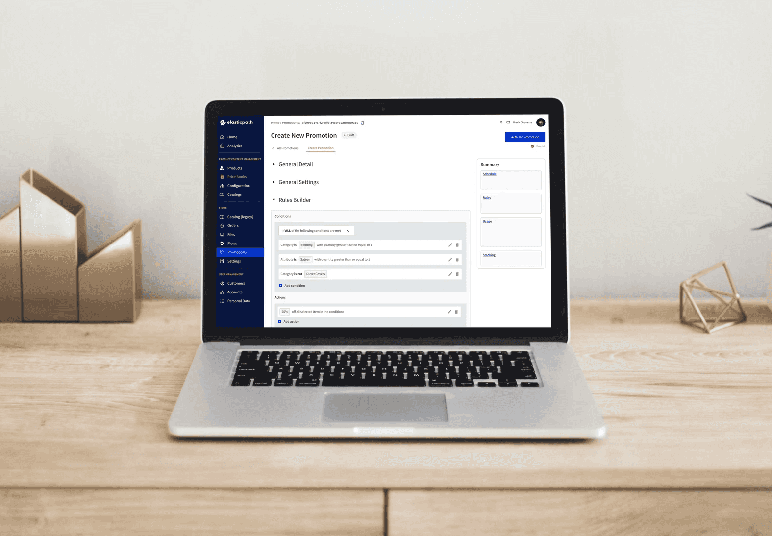
Elastic Path’s customers were not able to create a lot of the promotions they wanted using the existing promotions builder. The existing promotion creation flow was also quite confusing at times.
Task
I was tasked to redesign the promotion creation experience in a way that users could create complicated promotions, in a simplistic manner.
Outcome
Action
Conducted competitive research and put together different ideations of possible creation flows for feedback.
Created low-fidelity prototypes to conduct usability tests and customers walkthroughs for design feedback.
Worked with front-end developers to start pushing out some designs.
Result
The design was still in process when I left Elastic Path, but I was able to validate with customers that the new creation flow made sense and could satisfy their promotion creation requirements.
I helped onboard another designer to takeover this project.
Designs
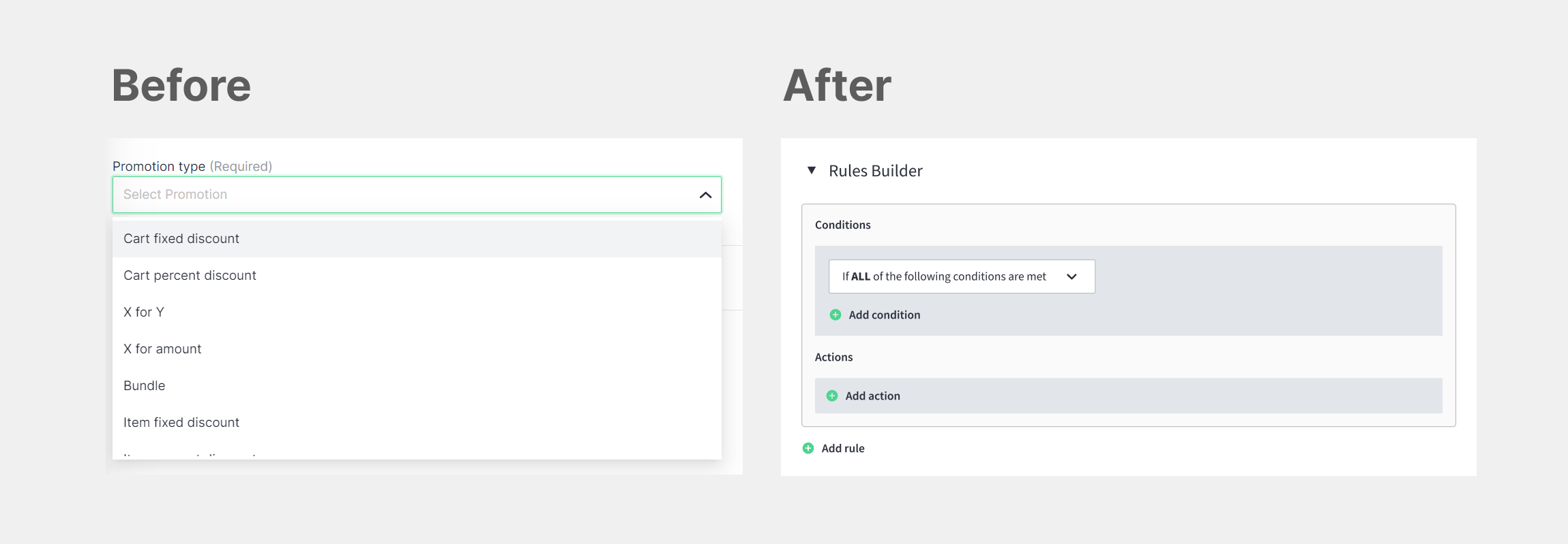
Before and After New Promotions Builder
Before the promotions builder, each promotion type available was very specific and had limited flexibility. With the new promotions builder, users are able to create flexible promotions through using different combinations of conditions and actions.
The Design Process.
Discover
⚠️The Challenge⚠️
As was a high-priority project, there was pressure to deliver quickly. This resulted in misalignment and required the team to regroup multiple times to make sure we were on the same page.
⚠️The Challenge⚠️
We needed to narrow down our focus and decide what use cases to focus on because it was not feasible to consider all the potential use cases for the Beta release.
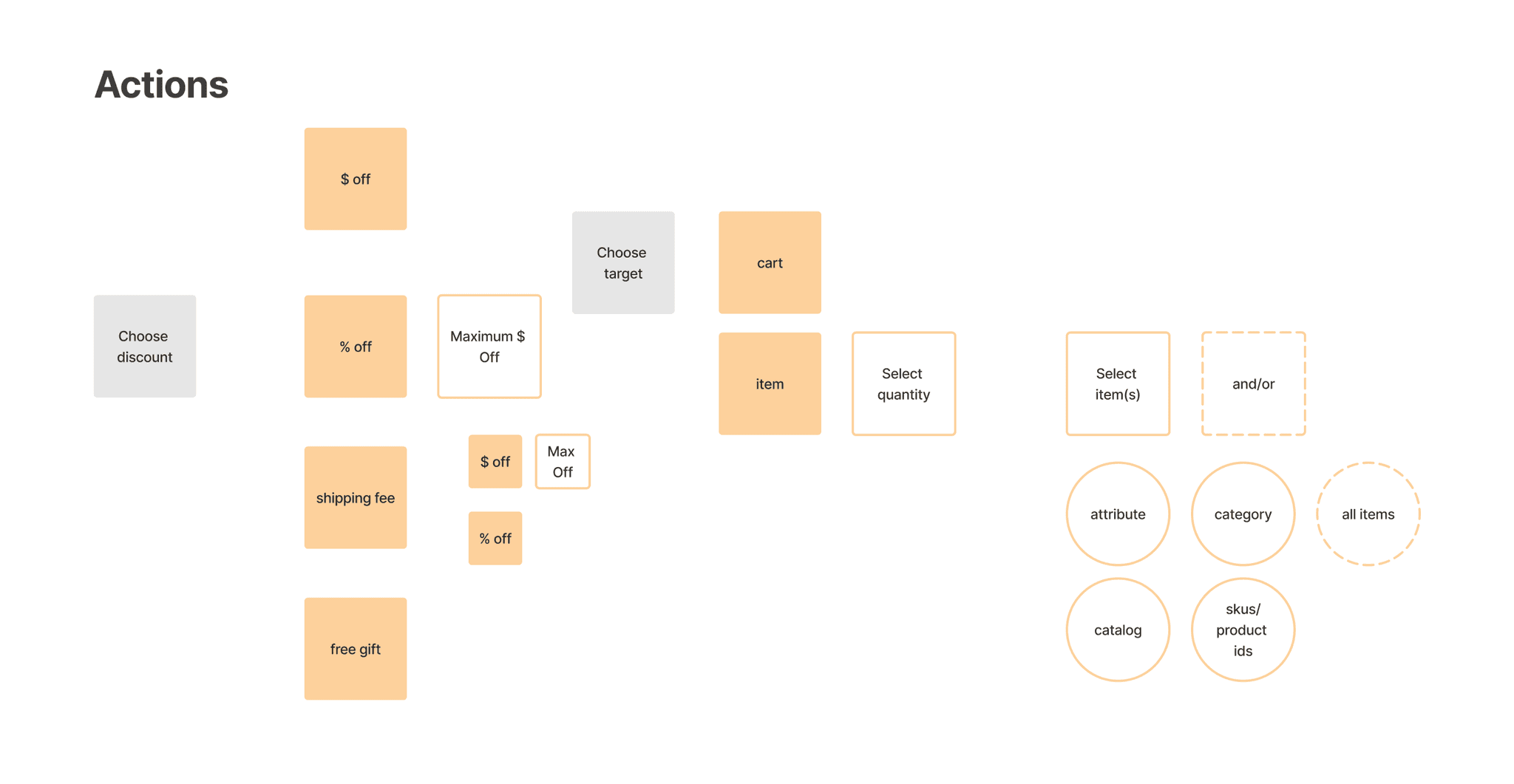
Promotion Creation Flow Diagrams
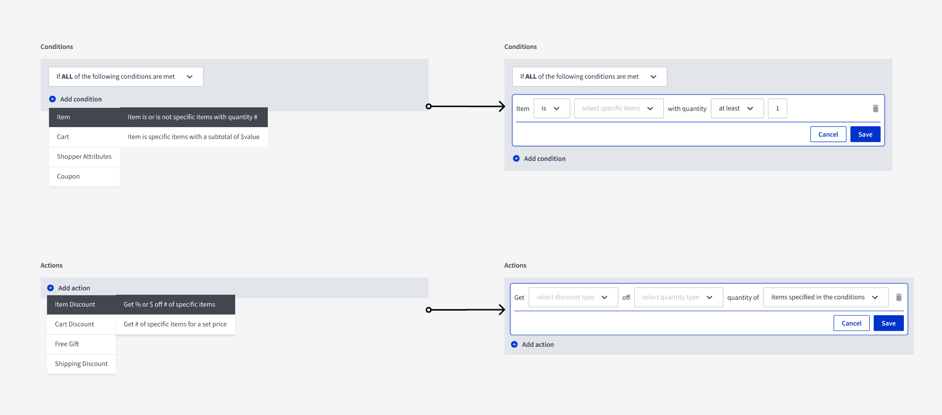
After, I identified the options that would fall under conditions and actions and used it to create a flow diagram to help the team visualize and map out how promotions could potentially be created.
Define
Beta Release Use Cases
Based on existing promotion usage metrics and experience working with customers, the team listed out different types of promotion use cases and highlighted what to focus on for the beta release.
Design Approaches
Initially, I explored the idea of creating a promotion rules engine that was completely dynamic, meaning that every selection available would be triggered based on the last choice.
Dynamic selections
However, it became apparent that while this offered great flexibility to users, it required too many dropdowns and choices which may be overwhelming for users trying to accomplish simple use cases.
Therefore, we decided to focus on increasing ease of use by removing the dynamic selections and instead, providing users with preset selections.
Preset selections
Develop
Usability Testing Designs
I conducted 7 usability tests to measure usability and to guide design decisions. While improvements needed to be made to the design, it was a good sign that we were on the right track.
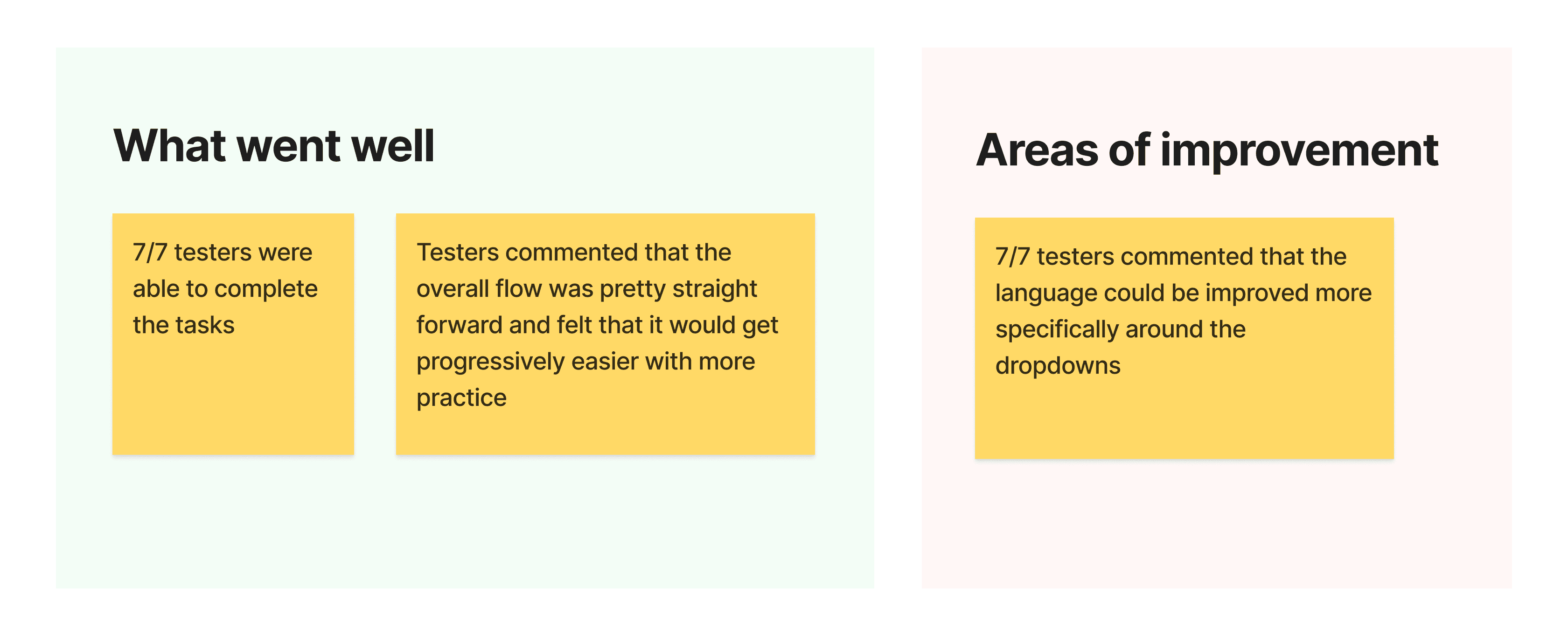
💡 Key Takeaways 💡
Usability tests should begin with a simple task to evaluate the foundational flow. Introduce more complicated tasks only if users found that the simple task was easy. Otherwise, it would be hard to distinguish if the flow was hard to understand or the task itself.
Developing a Sample Front-End
More iterations and progress were made on the designs, but up to this point, the design only existed on Figma and the team recognized that it needed to start coding out some of the designs to get a better understanding of what was required to move forward.
In doing so, the team made great strides not only in development but also from a UX perspective as further thoughts and insights were discovered from the functional prototype.

💡 Key Takeaways 💡
Though design may be led by UX, design is a team effort that includes developers. Developers think differently than designers. While designers iterate and refine solutions from wireframes and prototypes, developers do the same with coding.
Customer Design Walk-through
To evaluate our progress on our designs, I facilitated a walk-through session with a customer company that actively used our existing promotion service. In the walkthrough, I prompted them to get their input on what to click and to explain why as we went through the prototype.
From the walkthrough, we received positive feedback including that the customer felt that they could support all use cases with the new designs and that it was straightforward other than a few things, which we took to solve for our next action items.
💡 Key Takeaways 💡
I learned the importance of asking questions when facilitating walkthroughs, especially about what a customer expects to click to accomplish specific tasks.
Deliver
Beta Design Iterations
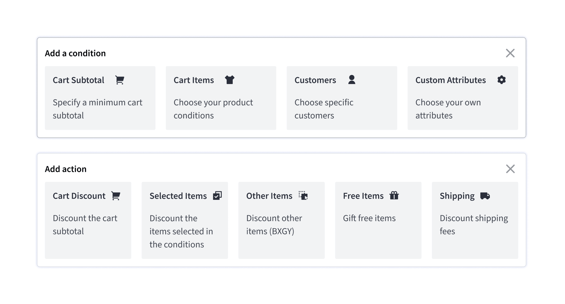
Taking into consideration the feedback from our customers and timelines, we began pushing our designs onto a test environment for the Commerce Platform and the team in middle of refining the copy of the rules engine to improve usability before I left the company.
Learnings
Importance of allignment
As this was a high-priority project, two product managers were involved to help speed up progress but this resulted in some misalignment. We learned to overcome it by seeking clarification when there was any uncertainty.
Focusing on solving simple use cases first
Initially, I tried to design to support both simple and complex use cases, but we struggled to keep the design simple yet flexible, especially given the tight timelines.
We decided to reduce the complexity and solve for the simple use cases first, and then if needed, come back to solve the more complicated use cases.
Designers can only do so much before development is necessary
The rules builder designs stayed in Figma for the first two months as the engineers on our product team were busy wrapping up other initiatives.
Even though I was iterating on the wireframes weekly, progress started feeling slow. it wasn’t until some designs were coded out that we were able to make important design decisions for our Beta release.
